Component Types
We subdivide the generic user interface into universal components that are present in each and every page, and other components that appear in specific cases.
Coloring of the highlighted sections in images
In images presented throughout this documentation manual, we encircle the relevant interface components in red, and the access points (or click triggers) to the components in orange.
Universal Components
Five components are highlighted in the image below. Clicking each area of this image redirects the user to the corresponding documentation page.
Specific Components
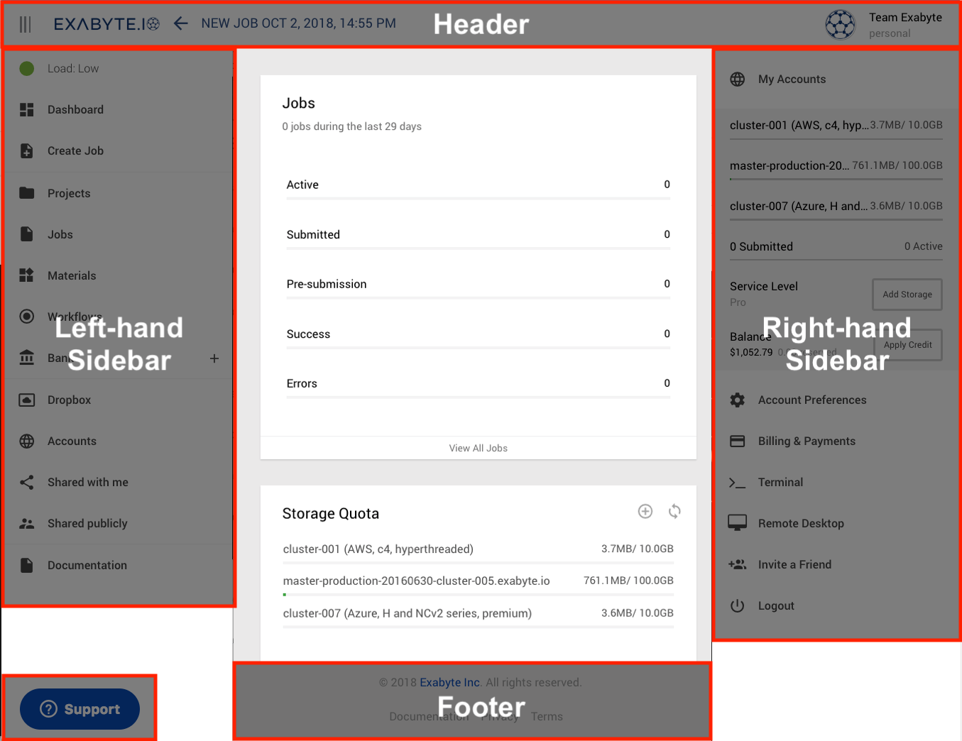
Other general user interface components are instead accessible only from specific locations. The panels highlighted below are worth a separate discussion.

1. Link to Homepage Navigation
The Navigation page is accessible through our company logo present at all times in the top header bar. This page explains how to use Navigation to make the initial general choices on the nature of the computations to be performed on our platform.
2. Link to Dashboard
A system status "Dashboard" can be accessed via the left-hand sidebar menu. It is explained in more detail in this page.
3. Tabs Navigation
Numerous pages on our platform, and most notably the Account Profile page, contain a series of Tabs for ease of navigation within the page. Such Tabs are reviewed here.